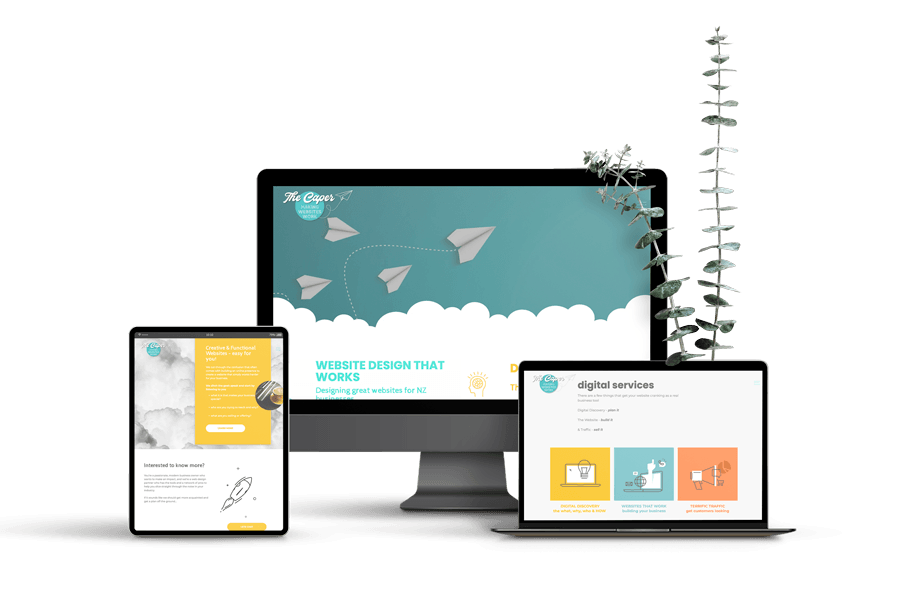
DIY Website Mistakes: 5 Common Pitfalls (and How to Fix Them Fast)
There’s a moment every small-business owner hits:
“Right—this weekend, I’ll just build the website myself.”
After all, WordPress is “open-source and powerful,” Wix promises “drag-and-drop bliss,” and Squarespace ads make it look like a five-minute job between sips of oat-flat white. So you grab a template, pick some colours, and three caffeine-fuelled days later your site is live. High-five!
Then reality knocks.
- WordPress feels less like freedom and more like a rabbit warren of plug-ins, theme updates, and suspicious “critical errors.” Every time you install something new, something else breaks. Security updates? Back-ups? Code bloat? You’re suddenly part-time sysadmin.
- Wix was gloriously simple—until you tried to customise that banner layout or add a fancy booking widget. Turns out the template grid is less “flexible canvas” and more “paint-by-numbers.”
- Squarespace looks sleek, but adding advanced SEO tweaks, custom checkout fields, or truly bespoke designs requires code injections and work-arounds that read like ancient runes.
Meanwhile enquiries are crickets, load speeds crawl on mobile, and you keep asking yourself: Is it just me—or does this still look off?
If that sounds familiar, take a deep breath. You don’t need a total rebuild; you need to dodge the five biggest DIY website mistakes—and apply quick, confidence-boosting fixes that turn “good enough” into good for business.
Let’s take a look...
1. The “Pretty but Puzzling” Homepage
Your homepage is your digital foyer. If it’s all chandeliers and no signage, people admire the décor, shrug, and leave.
Why it happens
DIY builders often lead with a giant hero image and a poetic headline like “Inspired Solutions for Modern Life.” Looks lovely; tells us nothing.
The fix
- Replace fluff with clarity: “Insurance advice for NZ families who want peace of mind.”
- Add a clear call-to-action button above the fold—“Book a free chat.”
- Keep one primary image that shows the service or happy customers using it.
Quick check: Can a stranger glance at your homepage for five seconds and know what you do, whom you help, and what to click next?
2. Frankenstein Fonts & Brand Soup
You’ve tried every Google font under the sun because… options! The result? A site that feels like five brands fighting for attention.
Why it happens
Templates come with pre-loaded styles. Each time you switch a section, those defaults sneak back in.
The fix
- Pick two fonts: one for headings, one for body text. Lock them in the global style panel.
- Choose a simple colour palette (primary, secondary, accent). Use Canva’s brand kit or your site builder’s style guide to store them.
- Run a “30-second squint test”: zoom out to 50 %—do the colours and fonts look cohesive?
Consistency isn’t fancy; it’s trustworthy. When your site feels stable, visitors feel safe hitting “buy”.
3. The Never-Ending Navigation Menu
You’ve crammed every service, sub-service, FAQ, policy, and blog category into the top menu. Visitors now need satnav and snacks.
Why it happens
DIYers try to surface everything at once, worried people won’t dig for info.
The fix
- Limit your main nav to 4–6 items.
- Use nested menus or a footer for secondary links (T&Cs, privacy, deep-dive blog categories).
- Write labels in plain English—skip the jargon (“Our Services” beats “Strategic Solutions Matrix”).
Less menu clutter means more clicks on the pages that matter—services, case studies, bookings.
4. Mobile Mayhem
On desktop your site looks ace. On a phone? Buttons overlap, text wraps weirdly, and the call-to-action is halfway to Auckland.
Why it happens
Template blocks are designed responsively, but custom tweaks (rogue padding, extra columns) break the flow.
The fix
- Preview every page in mobile view before hitting publish.
- Stack content vertically: hero, benefit bullets, CTA—no sideways scrolling.
- Use finger-friendly buttons (44 px height minimum).
- Compress images; large files cripple load speed on 4G.
Google now ranks mobile performance first, so this tweak alone can lift your visibility and user satisfaction in one swoop.
5. The Hidden Contact Path
Visitors love your vibe but can’t figure out how to take the next step. A phone number buried in the footer isn’t enough.
Why it happens
We assume people will hunt for contact details. Spoiler: they won’t.
The fix
- Place a bold “Book a Call” or “Get a Quote” button in the top-right header and again after each major section.
- Embed a simple, three-field form (Name, Email, Question) on key pages.
- Auto-reply with a friendly confirmation so they know the message landed.
Want to see how seamless booking flow feels? Our Digital Deep Dive audit includes a live walkthrough where we map your visitor’s path—from arrival to booked call—in under forty minutes.
Future Vision: Your Website, but Working
Imagine opening your inbox to a steady stream of “New enquiry” emails. Your brand looks cohesive across every page and device. Visitors arrive, get you, and click the obvious next step. That nagging “Is my site good enough?” voice? Gone. Instead, you have confidence—and more importantly, conversions.
Your website doesn’t need a total rebuild; it needs targeted tweaks. Start with the five fixes above and watch engagement lift. Feeling stuck? Book a Digital Deep Dive with The Caper. In one hour we’ll pinpoint your highest-impact improvements and send you a clear action roadmap—no jargon, no overwhelm, just results.
Ready to rescue your DIY website?
Let’s make it work for you.
More musings...